


FUNDAMENTALS OF COLOR THEORY AND COMBINATIONS
LEARN HOW TO EFFECTIVELY COMBINE COLORS

- Color palette and color scheme
- What is the difference between a color spectrum and a color palette?
- Itten's Color Wheel
- Color combinations
- Resources for color palette selection and color combinations
- Techniques for working with color
- Hues, saturation, and brightness
- Warm and cool colors
- The use of color and its emotional impact
Color palette and color scheme
When developing a color palette, one must consider several factors. First and foremost is the color wheel, a valuable tool that illustrates the relationships between colors. The primary colors, red, blue, and yellow, are the building blocks from which all other colors are derived. By mixing these primary colors, we obtain secondary colors—orange, green, and purple. Additionally, tertiary colors are created by blending a primary color with a neighboring secondary color on the color wheel.
What is the difference between a color spectrum and a color palette?
On the other hand, a color palette is a specific selection or combination of colors chosen for a particular purpose or artistic project. It is a curated collection of colors that work harmoniously together to create a desired visual effect. A color palette is typically a smaller subset of colors taken from the broader color spectrum.
While the color spectrum includes all possible colors, the color palette is a more focused and deliberate selection. Color palettes can be derived from the color spectrum by choosing specific hues, shades, tints, or tones that complement each other or convey a specific mood or theme.
In practical terms, artists and designers often create their own color palettes by selecting colors from the larger color spectrum. They may use tools like color wheels, color theory principles, or personal preferences to guide their choices. These carefully curated color palettes provide a cohesive and intentional visual experience in their artwork, design projects, or creative endeavors.
Itten's Color Wheel
Between the primary colors, Itten placed the three secondary colors: orange, green, and violet. These colors are created by mixing equal parts of the adjacent primary colors. The secondary colors form another triangle within the wheel.
In addition to the primary and secondary colors, Itten's Color Wheel includes six intermediate colors, which are
Another aspect of Itten's Color Wheel is the concept of color harmonies. These are specific combinations of colors that create a pleasing and balanced visual effect. Some common color harmonies derived from the wheel include analogous colors (colors next to each other), triadic colors (colors evenly spaced in a triangle), and split-complementary colors (a color and the two adjacent to its complementary color).
Color theory is included in the curriculum of many painting courses offered by Fantasy Room Online. In the "Acrylic Painting" course, every participant will learn the basics of working with acrylics through step-by-step lessons and instructor support. We will thoroughly explore the properties of this artistic medium, discuss various stylistic approaches, and create paintings on different themes such as landscapes and still lifes.
Lessons of the "Botanical Illustration" course will experiment with mixing and layering watercolor pigments to achieve realistic and vibrant color effects. The course will also provide guidance on color selection and how to capture the subtle variations and nuances in botanical subjects.


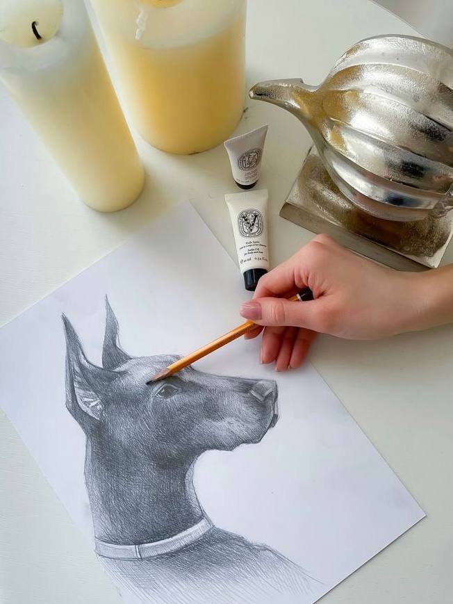
ANIMAL SKETCH

DRAWING HUMAN


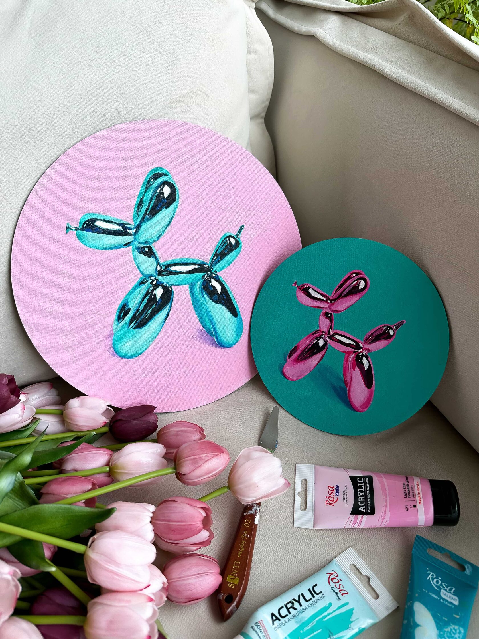
Color combinations
Complementary Colors
"Water Lilies" by Claude Monet: Monet's series of paintings depicting water lilies often incorporate complementary color combinations. In these works, you can find combinations of cool blues and purples with warm oranges and yellows, creating a captivating contrast.
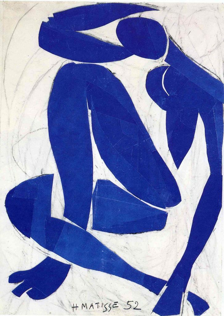
"Blue Nude" series by Henri Matisse: Matisse's Blue Nude paintings explore variations of blue as the dominant color. The monochromatic scheme creates a sense of calmness and elegance in the depiction of the female figure.
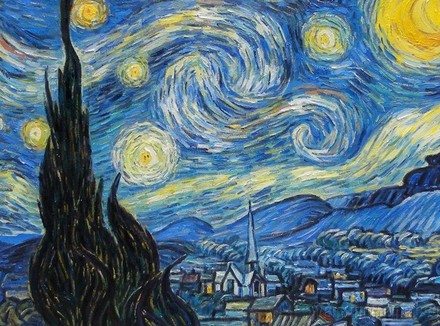
"Starry Night" by Vincent van Gogh: This iconic painting features a range of analogous colors such as blues, greens, and yellows. The combination of these colors creates a harmonious and serene nighttime scene.
When working with color combinations, it's essential to consider the context, intended message, and the emotions you want to evoke. Different color combinations can convey different moods and create distinct visual effects. Warm colors like red and orange tend to be energetic and passionate, while cool colors like blue and green evoke calmness and serenity.
In addition to the color combinations themselves, factors such as saturation, value, and proportion also play a significant role in achieving a balanced composition. Artists and designers should experiment, trust their intuition, and explore the vast possibilities that color combinations offer.
Examples of color combinations when mixing colors:
Yellow + Green = Yellowish-Green (Lime)
Yellow + Purple = Brown
Yellow + Orange = Warm Yellow
Yellow + Red-Orange = Orange-Yellow
Red + Blue = Purple
Red + Green = Brown
Red + Yellow = Orange
Red + Orange = Warm Red
Red + Purple = Magenta
Blue + Yellow = Greenish-Blue (Cyan)
Blue + Green = Blue-Green (Aquamarine)
Blue + Red = Purple
Blue + Orange = Dark Orange
Blue + Purple = Blue-Purple (Lavender)
Resources for color palette selection and color combinations:
- Adobe Color (https://color.adobe.com) - This tool allows you to create and explore various color combinations based on the principles of color theory. You can choose ready-made color palettes or create your own.
- Coolors (https://coolors.co) - This website offers random color palette generation or manual creation. You can adjust saturation, brightness, and other color parameters.
- Paletton (https://paletton.com) - It is an interactive tool for creating color combinations based on Itten's color wheel. You can experiment with different hues, tones, and contrasts.
- Color Hunt (https://colorhunt.co) - This website offers a large collection of ready-made color palettes created by other users. You can search and choose palettes that suit your project.
- Canva Color Palette Generator (https://www.canva.com/colors/color-palette-generator) - This tool helps you create color palettes based on the image you upload. It automatically extracts colors from the image and suggests combinations.
- ColorSpace (https://mycolor.space) - Here you will find various color palettes, including complementary, analogous, and other combinations. You can also adjust the saturation and brightness of the colors.
Techniques for working with color
Color is a powerful tool in art and design that allows creators to evoke emotions, set moods, and communicate ideas. Mastering the techniques for working with color opens up a world of creative possibilities. In this article, we will explore various techniques that artists and designers employ to effectively work with color, from basic principles to advanced applications.
Color is a powerful tool in art and design that allows creators to evoke emotions, set moods, and communicate ideas. Mastering the techniques for working with color opens up a world of creative possibilities. In this article, we will explore various techniques that artists and designers employ to effectively work with color, from basic principles to advanced applications.
Wet color blending is a painting technique that involves applying wet paint to a surface and allowing the colors to mix and blend together. It is a versatile technique used by artists to create smooth transitions, gradients, and soft edges in their artwork. The process of wet color blending typically starts by wetting the paper or canvas with water or a wet brush. This creates a receptive surface for the paint to flow and spread more easily. Once the surface is wet, the artist applies their desired colors using a brush or other painting tools. The wetness of the surface allows the colors to blend naturally and create seamless transitions.
Dry color blending is a painting technique that involves blending colors using dry media, such as colored pencils, pastels, or dry brush techniques. Unlike wet color blending, which relies on the use of water or wet paint, dry color blending achieves its effects through layering, smudging, and the pressure applied while working with the dry medium.
When using dry color blending, artists typically start by applying layers of colors in a gradual manner. They use light strokes or gentle pressure to build up layers of pigment, allowing the colors to blend and mix directly on the surface. By layering different colors on top of each other, artists can create unique hues, smooth transitions, and interesting textural effects.
Hues, saturation, and brightness
Hues
Warm and cool colors
Warm Colors
Warm colors include red, orange, yellow, and their various shades. They are associated with warmth, energy, passion, and vitality. Warm colors can evoke feelings of excitement, enthusiasm, and happiness. They have a tendency to advance visually and can create a sense of closeness or intimacy. In art and design, warm colors are often used to attract attention, convey a sense of vibrancy, or create a focal point.
On the other hand, cool colors encompass blue, green, purple, and their various shades. They are associated with calmness, tranquility, and serenity. Cool colors can evoke a sense of distance, spaciousness, and relaxation. They have a visual tendency to recede, creating a feeling of depth or openness. In art and design, cool colors are often used to establish a soothing atmosphere, convey a sense of professionalism, or evoke a sense of nature. For instance, Monet's peaceful water lilies or a serene landscape with cool shades of blue and green can create a sense of calm and tranquility.
It's important to note that warm and cool colors are not limited to specific hues but rather encompass a range of shades and tones within each group. Warm colors can have variations such as warm yellows or warm reds, while cool colors can include cool blues or cool greens. By exploring these variations and understanding their properties, artists and designers can create nuanced and captivating compositions that effectively communicate their intentions.
The use of color and its emotional impact
Colors have the ability to evoke certain emotions and associations due to cultural, historical, and personal factors. While individual responses to color may vary, there are some common emotional associations that many people experience.
In addition to individual colors, color combinations and palettes can also influence emotions. Complementary colors, such as red and green or blue and orange, create a sense of vibrancy and contrast. Analogous colors, such as various shades of blue or green, create a harmonious and soothing effect. Color harmony and balance are essential considerations in creating visually appealing and emotionally impactful designs.
In conclusion, color is a powerful tool that can evoke emotions, convey messages, and shape perceptions. Understanding the emotional impact of different colors and color combinations allows us to use color strategically in various fields, such as art, design, marketing, and communication. By harnessing the psychological power of color, we can create impactful and engaging visual experiences that resonate with audiences on an emotional level.
Let's conclude:
Удобство
Understanding the principles of color theory provides a solid foundation for creating visually captivating compositions. By comprehending the color spectrum, color palettes, and the color wheel, artists can make informed decisions about color selection and combinations that effectively convey their intended messages.
The knowledge gained from studying color theory and combinations is invaluable for artists and designers. It enables them to express their artistic visions with clarity, evoke specific responses from viewers, and create captivating and impactful artworks. Understanding the fundamentals of color empowers artists to effectively communicate their ideas, narratives, and emotions through a powerful visual language.


